YouTube Music logo lockups
Contents
Visual system
Introducing the YouTube Music visual system. Whenever possible, please use the logo lockup instead of the icon.
Marketing logo lockup
App icon
YouTube Music logo lockups
Two-color versions
Please aim to use the two-color logo lockups whenever possible. If the background color clashes with the two-color lockup, then please use our monochrome lockups.

YouTube Music logo lockup
YouTube Music logo lockup (white)
Monochrome versions
Please use our monochrome logos if the background color clashes with the two-color lockups or if our lockup is being placed next to a partner’s monochrome logo.
YouTube Music monochrome lockup (black)
YouTube Music monochrome lockup (white)
Clear space
The amount of clear space around the logo lockup should be equal to or greater than the size of the triangle in the icon.
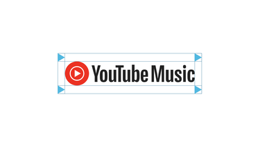
Clear space requirements
Minimum size
To ensure the word “YouTube” can always be read, the lockup should never appear smaller than the following minimum sizes:
- Digital application: 20dp
- Print application: 0.125 inches or 3.1 mm
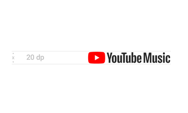

Minimum size (digital)
Minimum size (print)
Incorrect usage
We love our logo lockup, but it’s been constructed to strict standards. Here are some examples of what not to do with it.
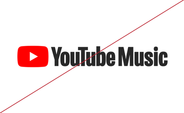


Don’t alter the lockup’s font weight.

Don’t alter the lockups colors.
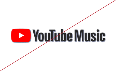
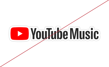

Don’t create a reflection or a shadow on the lockup.

Don’t outline the lockup.
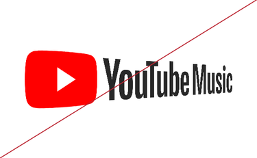


Don’t add perspective or skew the lockup in any way.

Don’t rotate the lockup.
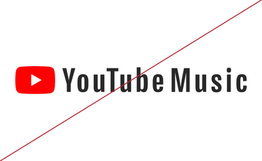

Don’t change the spacing or kerning of the logo.

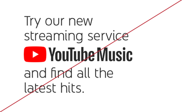
Don’t use the lockup in a sentence.
